


INFORMATION FLYER
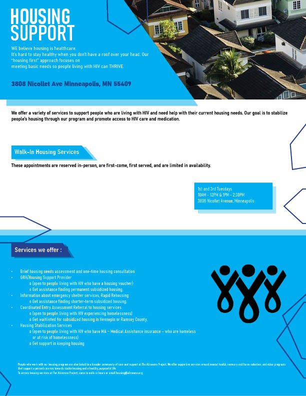
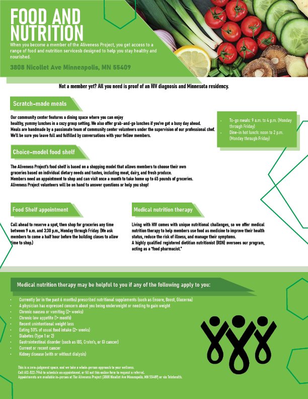
For this assignment, we were tasked with designing a flyer for a company called The Aliveness Project. Each flyer represents a different service offered by the organization, and I used three distinct colors to visually distinguish each one. The logo and content were provided, and I used them to build the overall foundation of the three flyers. For the Food and Nutrition flyer, I chose the color green because it aligns well with the theme of food and freshness. For the Housing Support flyer, I used blue to convey a sense of calmness and reliability. Lastly, for the Case Management flyer, I selected red to represent action and urgency. I used Adobe InDesign to create the layout and incorporated relevant stock imagery for each service, pairing them with the color schemes to enhance visual understanding and impact.